Demonic Text Generator
Turn normal text into possessed, dripping demonic text with adjustable intensity. Copy and paste to Discord, TikTok, Instagram and more.What “Demonic” Actually Means When It’s Text
It is not a technical term. It is a vibe — and everyone recognizes it.Here’s the thing nobody says out loud: “demonic text” isn’t a technical term. There’s no Unicode consortium meeting where someone defined what makes text demonic versus merely cursed. It’s a vibe — and like most vibes, everyone recognizes it but nobody can quite explain it.
When people say they want demonic text, they usually mean one of three things. The first is heavy Zalgo — text so buried in combining marks it looks like it’s bleeding off the screen. The second is gothic blackletter — those heavy medieval-style letters that look like they belong on a cathedral door or a metal album cover. The third is some unholy combination of both: blackletter foundations with corruption dripping off every letter.
Our demonic text generator leans into that third interpretation. It takes your normal text and applies the heaviest, most aggressive styling we’ve got — dense combining marks stacked above, through, and below each character, with a bias toward the downward drips that give it that “something is leaking through” quality. The result doesn’t look glitchy in the digital sense. It looks wrong in the way that makes people do a double-take.
Is it actually demonic? Of course not. It’s Unicode. But it reads as demonic, and in text, reading is everything.
How the Corruption Gets Built
The same Unicode trick as all cursed text, just pushed harder and aimed downward.Under the hood, demonic text uses the same fundamental trick as all cursed text: Unicode combining diacritical marks. These are special characters designed to attach to the letter before them — the same mechanism that puts accents on letters in French or Vietnamese. The difference is one of restraint. Where a language might use one mark per letter, demonic text stacks six, eight, sometimes a dozen.
What makes our Demonic style distinct from the regular Zalgo style is the distribution of those marks. Standard Zalgo spreads chaos evenly — marks above, below, and through each letter in roughly equal measure. Demonic is deliberately bottom-heavy. More marks drip below the baseline than rise above it. The visual effect is text that looks like it’s melting downward, like wax or something less pleasant.
There’s also a density question. Demonic runs at a higher mark count per character than our other styles by default. Where Void might use one or two marks per letter and Zalgo uses five or six, Demonic pushes toward eight or more. It’s the difference between “slightly off” and “actively hostile.” You can dial it back with the intensity slider if you want the demonic flavor without the full possession.
None of this requires a special font. That’s the whole point. Every mark is a real Unicode character, which means the text copies, pastes, and survives as actual text everywhere Unicode is supported. No images, no font files, no tricks.
Demonic vs. Zalgo vs. Gothic Blackletter
Three names people mix up, three genuinely different looks.People use these terms like they’re interchangeable. They’re not, and knowing the difference will save you from picking the wrong style for the wrong moment.
Zalgo is chaos for chaos’s sake. Marks everywhere, no particular direction, maximum visual noise. It’s the “my text got corrupted” look. Great for horror, great for shock value, terrible when you want someone to actually read what you wrote.
Gothic blackletter is the opposite approach. No combining marks at all — just whole-character swaps into the Mathematical Fraktur Unicode block. Every letter is replaced with its blackletter equivalent. It’s clean, it’s readable, and it looks like a medieval manuscript. The downside? It’s almost too clean. It reads as “fancy” more than “frightening.”
Demonic sits between them and steals from both. It has Zalgo’s aggression — the stacked marks, the visual overflow — but with a deliberate downward bias that gives it direction and intent. It doesn’t look randomly corrupted. It looks deliberately corrupted, like something chose to write this way. That intentionality is what separates “glitchy” from “demonic” in most people’s minds.
Rule of thumb: pick Zalgo when you want digital horror. Pick blackletter when you want gothic elegance. Pick demonic when you want something that looks like it crawled out of somewhere unpleasant.
Finding Your Level of Menace
Not every situation calls for maximum possession.Not every situation calls for maximum possession. Here’s how we think about the intensity levels:
Light (1–3): A few marks per letter, mostly below the baseline. The text is fully readable but clearly off. This is the sweet spot for usernames and display names — enough to turn heads, not enough to get filtered.
Medium (4–6): Visibly corrupted. Letters are recognizable but you have to work for it. Good for short captions, Halloween posts, horror story titles — anywhere the aesthetic matters more than quick readability.
Heavy (7–8): The full experience. Text becomes texture more than language. Use this for dramatic effect — a single line in a Discord announcement, a chapter heading, a username designed to make people uncomfortable.
Maximum (9–10): Honestly? This is more art than text. The letters are technically still there, but good luck finding them. We included it because people asked for it, not because we recommend it.
Our advice: start at 4 or 5 and adjust from there. You can always add more corruption, but you can’t unread something you’ve already posted.
Where Demonic Text Actually Renders
The characters are identical everywhere. The rendering is not.Here’s the uncomfortable truth about all heavily-styled Unicode text: it doesn’t look the same everywhere. The characters are identical — that’s guaranteed by the Unicode standard — but how they render depends on the fonts and text engines on the receiving end.
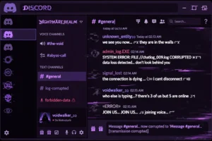
Discord handles demonic text about as well as anywhere. Messages, server nicknames, and channel descriptions all accept it. The username field itself is restricted — that’s a Discord policy, not a technical limitation — so use your display name or nickname instead.
Instagram and TikTok are generally fine with it in bios and captions. Bios have character limits, and heavy demonic text eats through those limits fast (each combining mark counts as a character), so keep it short.
Gaming platforms are the wildcard. Steam is fairly permissive. Roblox is strict — their filter strips most combining marks, so demonic text usually comes out looking neutered. If you’re making a Roblox username, stick to light intensity and test it before you commit.
The golden rule: test on the platform before you commit to it. Paste a sample, check how it looks on both mobile and desktop, then decide if the effect is worth the character budget.
Common Mistakes People Make With Demonic Text
What we have seen go wrong, so you do not have to.We’ve seen enough demonic text in the wild to know where it goes wrong:
Using maximum intensity for everything. A username at intensity 10 is unreadable, and an unreadable username defeats the purpose of having a username. Save the maximum for single dramatic lines.
Forgetting about character limits. Every combining mark counts as a character on most platforms. That 12-letter username at heavy intensity might be 80+ characters under the hood. Keep it short or keep it light.
Not testing on mobile. Mobile rendering is less forgiving than desktop. Always check the final result on the device where most people will see it.
Using it for anything important. Demonic text is a costume, not a uniform. Wear it where costumes are appropriate.